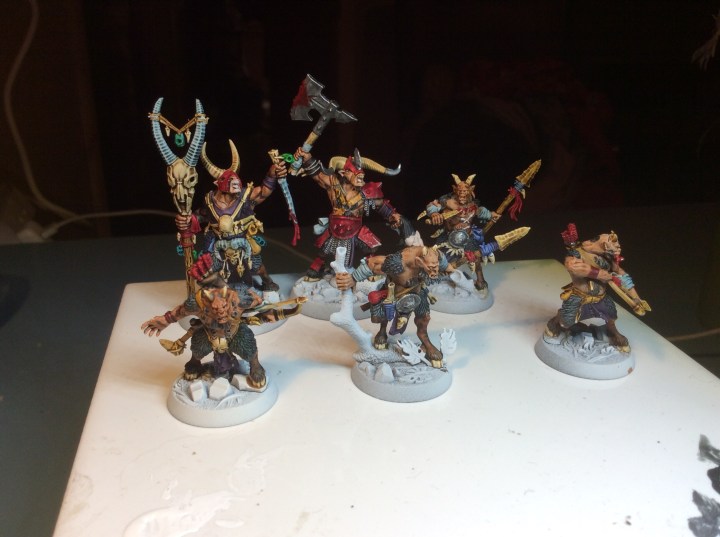
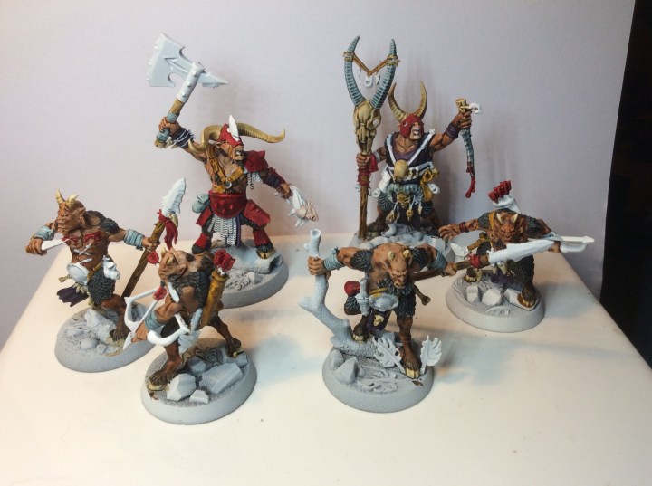
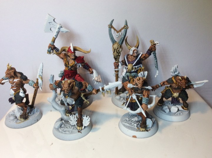
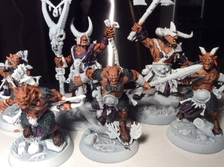
This evening saw the end of the painting for the Beastmen. There was a bit more than I thought there would be and to be honest when I add the photo to here in a bit I am bound to see something I missed! 😂

As promised I have added both factions side by side…
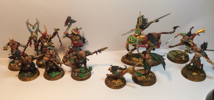
I have thoroughly enjoyed painting both factions. I don’t actually know if I have got a favourite one.
My aim for this lot was to paint in only contrast paint, and to be truthful, I used some AP Dark wash for the black and a dot of blue for a wash on the severed head. The metallics were done in GW standard paint. But that is it – once the white spray was done everything after that (apart from the above) was Contrast. Some white was used to tidy up, but that took it back to the base spray colour.
So what have I learned from this…
First off, I like Contrast paint… I was really pleased with it for the 10 and 15mm minis, but this was the first time doing a full 28mm miniatures and I am chuffed with the results. These are quite textured miniatures, I might dig out my space marine scouts and see what happens to them.
Secondly, the paint on the whole does what it is meant to do, I like some other people, was sceptical. My kids got me some for my birthday. I got a few more, then a few more and a few more still. Since getting a bigger range I haven’t touched the AP paints at all. I think my initial scepticism was unfounded.
To be fair some colours work better than others. Over white, the black looks dark grey, but I reckon putting it over a grey base coat would darken things down a bit, either that or stick to going over it with the AP dark tone.
So like most things there are down sides too…
Price, these things ain’t cheap, and if you add in the ‘special’ spray cans, individual pots of matching undercoat and mixing medium then things get pricey very quickly. If you are like me, you can buy a grey and white auto spray can that costs about £4.00 and go over the top of that with the Contrast paint. I have a pot of Matt medium which, at 500ml will last me a good while.
Pot design – same crap design as usual, tall pot that easily overbalances and pours your expensive paint everywhere. I 3D printed a pot holder and so far I have been lucky when I haven’t used it. Luckily the paint is thin, so the tops are closing properly. However on some of the ones I have used a lot I have noticed a build up of residue.
Stupid bloody names. I have each pot that I own written down, so when I go into the shop as I can’t remember them, let alone spell them. When writing up my blog, if they are in front of me they get named, if they are back in the box then they are brown, blue or red paint. One day they may come up with names like Khaki shit and nipple pink, at least I would remember them.
So in short, even with the failings mentioned above, I do like them. I must, as my new GW standard paint totals about five pots and three of them are metallic!
So moving away from the miniatures for a bit
Well this has to be one of the best adverts for Remembrance I have seen in a long time…
https://www.youtube.com/watch?v=ahGRNKi8-18&feature=share
It made my a bit tearful to be honest. Not sure why. I never met my Grandad on my dad’s side he died ten years before I was born in 1956. He survived a gas attack at 3rd Ypres and after being invalided out of the army he returned to the North East of England and returned to the mines where the coal dust finished off what the gas had started. He was one of the ones that made it home at least.

I have been doing Remembrance with my class, and showed them the Reawick war memorial embedded in the cemetery wall. It has the dead split into three groups, lost at sea, killed in action and also died of illness contracted during service. I have never seen this before. The only thing I can think of in this case is that they outnumber the other two causes of loss.

Still one of the best songs out there…
https://www.youtube.com/watch?v=XDyip7SIJkQ&feature=share
Not to forget this too…