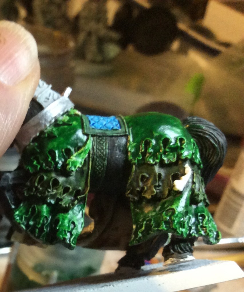
The photos look like I haven’t achieved much this evening, I have in fact repainted all of the green on the horse barding as well as the Knight…
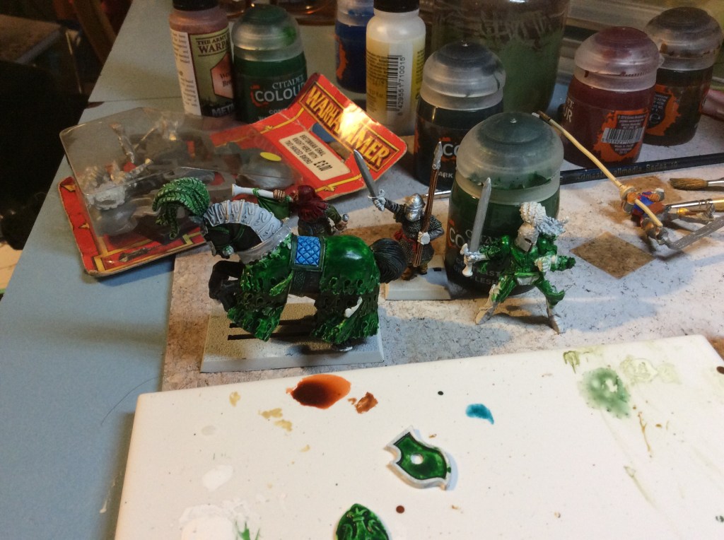
I decided to try and do some highlights by drybrushing white over the green and then doing a single layer of contrast…it looked total shite.
So I repainted it all in white again only to find that the White wasn’t taking the Contrast, so as you can see it and still shiny. After much swearing I then overturned a pot of opened Contrast. Luckily I had a big brush handy and saved about 90% of it.
I honestly don’t know what is going on with the Contrast, but I believe that the problem is the white I am using as it went fine over the spray paint and has only really been an issue over the brushed on stuff. Perhaps it is time for a new white.
But the highlight of the early evening had to be trying to clear the header of the septic tank. Luckily I have no sense of smell. It took about an hour before we got it sorted. In the process I managed to badly twist my ankle… luckily I am back to work tomorrow so that should take my mind off things.
Shetland has now hit 84 cases, ten more today. All fallout from the original party.

It’s a total sod, when you have to go back to square on with a figure, I’ve never tried contrast paint, though it does seem very popular at the moment, but I have to say you’re now selling it to me with this post 😁.
Yep cases on the rise here too, thought this was going to happen after Christmas, actually everybody thought this was going to happen except Boris apparently, tell you something doesn’t it.
Cheers Roger.
LikeLiked by 3 people
To be honest I love the Contrast paint and pretty much everything I have done over the last year and a half is done with it. There are two options, First is that the paint is a year old and is maybe going a bit weird or it is the undercoat that I am using that is causing the grief. I will have to do some experimentation.
LikeLiked by 2 people
I think the contrast paints settle a lot more than others, and this sometimes gives the a gloss look. I’m thinking about getting some ballbearings to put in to help when shake it up. I’ll let you know if I do it and if it helps!
LikeLiked by 3 people
Cheers mate
LikeLiked by 2 people
The more I think about it the more I think you are right. The White was in a lump on the bottom. The green I used hadn’t been used in an age and although I gave it a bloody good shake I think it might still be a bit on the thin side, hence the problems.
LikeLiked by 4 people
I’ve been using contrast paints a bit and getting some of these variations, and thats what I’m putting it down to. I also work in the paint / ink industry and this paint is actually a rather hard technical ask with it being so thin and with so much pigment in it, so these problems make sense from a technical perspective in my opinion.
LikeLiked by 4 people
Cheers mate, nice to have an insider view on things
LikeLiked by 1 person
For the Contrasts and Citadel wash pots, I definitely suggest printing some holders! You can find several for free on Thingiverse, they’ve saved me from a fair few paint spill catastrophes.
LikeLiked by 5 people
I had one right next to it, just forgot to put it in 🤯🥴
LikeLiked by 4 people
Even a printer can’t save you from everything 😀
LikeLiked by 2 people
That is quite the contrast you’ve gotten there with those contrast paints! I’m still not sold on this fad, I’m sticking with learning to blend and highlight better 😉
Still can’t wait to see the finished miniature!
LikeLiked by 3 people
I’m stuck in the midst of a repaint myself, with a green as well. Sucks, because I had an initial test run on some bits, but then having to redo my work. I can feel your pain.
LikeLiked by 3 people
Drybrushing white on that dark of a green is definitely tricky. You might try mixing white with a bit of green to see if that goes on a bit smoother. It may be a little less bright than you were looking for but the only other way I can think of to get a strong white border would be a couple layers of white edge highlights which would be pretty time consuming.
LikeLiked by 2 people
Cheers mate. I reckon that the White wasn’t mixed properly tied in with the Contrast being a bit watery too then it compounded the problems.
LikeLiked by 2 people
I have found with the contrast paints that it helps to use a q-tip (cotton swab) to stir the bottom of the pot and then roll the q-tip on my palette – plus contrast medium is a must to thin to taste (of color not consuming)..
LikeLiked by 1 person
Cheers Mark… good ideas there.
LikeLiked by 1 person